Audience page
With a shift of product offering from SMBs to Enterprise, I had to design to serve a new demographic of users: Account Managers and Insights Managers. These users required a deeper view of the data that represented their audience, define segments based on profiling points and monitor their behaviours and sentiment over time.
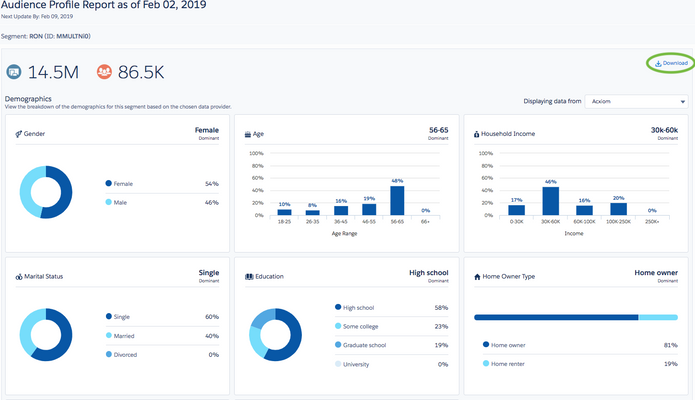
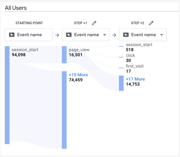
The data on the audience was divided into Users and Non Users for each brand, but their user journeys overlapped, as non users of one brand could in fact be users of a competitive brand. The insights managers would typically monitor several different brands within a category: Their own brand(s) and the competition brands. They wanted to view the user journeys from all to inform their strategies based on the competition.
A complex issue arose: How do we display data from two different streams that fork into N number of categories?
I broke down the PRD into the following tasks:
-
Enable Insight managers to create segments by adding or removing profiling points.
-
Allow the segments to be visible but not editable to Brand Managers.
-
Show the data for each segment over time for every category and brand
-
Display the different streams of audience data and edge cases (eg. if the data is still being gathered and the sample is not robust enough).
1. Ideation
🧠
Research & Brainstorming
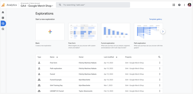
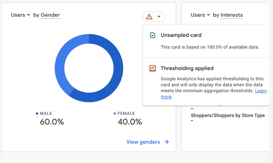
I took the time to research other tools that my users would be familiar with and extracted ideas for data visualization, user journeys and work flows that I could use as the bones for my own. This is to ensure a lower cognitive load for my users, as they would be dealing with a lot of analytic heavy information. It can be quite overwhelming!
The interviews with our enterprise users revealed that most of them used Google Analytics, Tableau and Salesforce... and Excel!
Yes, they claimed to use excel to download CSVs and then create their own charts 🤯.
Defining & Drafting
From the findings I was able to extract the goals of the users, their expectations, diagnose the pain-points of the software they were used to and identify what they actually wanted to know:
-
Customization
-
Downloadable
-
Bird eye view
-
Compare mode
-
Change over time
Workshopping with the Project Manager, the head of Front End Engineering and a Human Science expert with experience as an insights manager in marketing I compiled a list of requirements, flows and low-fi designs in a few iterations.
2. Workshop
🛠


Data viz being my area of expertise, I devised a plan to ensure that all the important information could be extracted as a glance. I call it the 3-2-1 rule:
From top to bottom of the page, I structure the information like this.
- The first 1/3 of the screen is to see the highlights (30 seconds to read)
- The other two thirds of the screen is to seconds to take action on the information (2 clicks away)
- 1 separate screen to complete and confirm these actions ( a dialog or modal)

Within the 5 day Design Sprint sessions I made sure to loop in and test with my team, and update the PRD with any new features or ideas that came up along the way. It was a very challenging but fulfilling project, and having a flexible list of requirements allowed me to be more creative with my designs.

I placed utmost importance on the integrity of the data being presented. For this reason I attached tags to show the robustness of the sample size and ensure the user was informed of the quality before taking any further action.
This was important for things like dicing and slicing segments, the profiling points they chose and the proportion of the national representative that each result represented.


3. Testing
🧪
Prototyping & Observing
Using the same people from the interviews plus other users that hadn't been involved in the research stage I conducted an A/B test and carefully monitored with minimal interference.
I felt it was very important to keep my involvement with the users low, since it was a whole new feature - I had to see how the users naturally would navigate and validate the hypothesis set at the beginning: I wanted to confirm I had designed something familiar yet an improvement from the software they were used to.

Results
The success metrics that I and the Product team were tracking showed very positive results. Some not so positive though:
-
Visits per session from Brand Managers: up by 20% within 5 weeks.
-
Visits per session from Insights Managers: up by 70% within 5 weeks.
-
User satisfaction: from interviews we and surveys we had an average of 3.9/5 in reported satisfaction. It was mostly insights managers who were the happiest, although they would have preferred more abilities.
-
Number of Dowloads: The downloads of CSVs were observed from the launch to 5 weeks after launch and revealed that they downloaded an average of 1.2 times a month, so they were not necessarily looking to report on a weekly or daily cycle.
-
Number of visits: from its launch up to 5 weeks in, it had increased by +150%, meaning more people were finding this page useful.
-
Time spent on page: It had gone from an average of 10 minutes to 17.9 minutes, which was expected to go down as the users became more familiar, but we chalked it down to them discovering more features. It turns out they were taking screenshots!


