Enhancement
Mobile Survey Experience
When I first started at ProquoAI I was introduced to their surveying method to capture user's sentiments: system 1 vs system 2 thinking (if you are familiar with this you've probably read "Thinking Fast and slow"). With this method of surveying they were able to gather data on feelings and compare them to how the brands in their portfolio were performing. But there was a major issue.

Problem statement
A colleague in the Data Science team pointed out to me that there was a large dropout rate from the surveys, and a lot of junk responses that were contaminating the data. A quick UX audit revealed that survey experience was tedious, non - linear, confusing and allowed users to essentially "cheat" to get through the questions faster.
Vision
-
Make the survey Mobile First: this was firstly to fix the scalability of the components to all device breakpoints; and secondly to make the surveys easier to take on the go.
-
Introduce a linear flow to the survey, with breaks for encouraging messages and delightful interactions to trigger the user's reward response.
-
Enforce a method to cap the speed at which users went through the surveys with timer buttons, conditional "continue" triggers and a swipe/click calibration to filter out idle swiping and autocorrect filler text.

Method
01
UX Audit
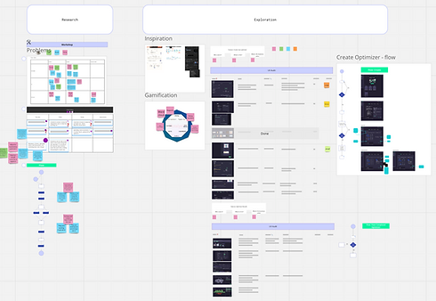
The first step was to break down all the UX violations on the platform.
I outlined a solution for each issue and a possible low fi design attached to it.
The front end Dev assigned the task worked with me in this process, as I was relatively new and he was familiar with the ins and outs.
03
UI Makeover
Once the journeys were set, I created a new design standard for the surveys: responsive, mobile-first design.
This would ensure the users were able to comfortably take the surveys on the go.
02
Define Journeys
Next step was to create more linear, logical journeys. The principal reason for the dropout rates was that the user was confused and frustrated with the flow of the survey. They couldn't tell how far along they were, how much they had to go and would get repeated questions without context.
04
Test
Finally a link to the developer environment of the surveys was sent out for internal testing.
The sessions were monitored using smarktlook, and I conducted 3 interviews with a member of the Customer Experience team, the Dev team and the Data Science team.
Challenges
Testing the UI changes in all the browsers raised more compatibility issues than anticipated
The designs had to be changed to stay consistent throughout all browsers and device breakpoints.
It was a long and repetitive process, as the bugs kept popping up, but resulted in a consistent experience for all users.
WORLDWIDE
Some of the survey takers found a loophole!
They were able to skip the ranking questions
It was observed in the data that some of the responses were blank when they should have a mandatory. It turns out that if the raking questions were left as they were they'd be stored as valid answers instead of null. To fix this I disabled the button and changed the interaction from "arrange these in order" to a "drag and drop".
WORLDWIDE
The experience was compromised by some questions being asked to the wrong user
Some of the users would answer "I don't know this brand" and then be asked questions about said brand regardless. Funnily enough we observed it was because there was no option for them to say "Not applicable". I had to add a new journey to allow these users to branch out form the predefined flow and store their responses against their user ID.
WORLDWIDE
Gallery
Accessibility
A big part of my focus was around accessibility: since users would be on devices of various sizes and the demographic targeted different age groups, a must was to make buttons easy to hit targets and to allow a dark/light mode switch.
I thought it would be a good start to welcome the users in their language of choice, setting the tone of the rest of the survey.


Calibration
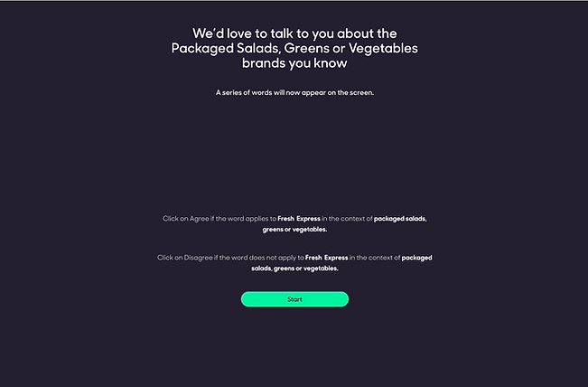
In order to ensure the users weren't blitzing through the survey, I included a step to measure the average speed of swipe/click interactions with a simple guided exercise before they began answering.


Guidance
To make sure the users stayed engaged (and not despair) a progress indicator was necessary - but just as much as stopping them from clicking "continue" to skip the questions I disabled the button until an input was entered, or added a 30 second timer to the button.
Testing
The final step was to test the flow in a prototype both for desktop and mobile.
Impact
To measure the results of these improvements to the survey a mix of methods were used:
Dropout rates decreased by 9.2%
The user feedback was positive, describing the new look and feel as "light", "linear", "logical" and... "like a plushy" 😂
The DataSci team were happy with the new quality of responses with "Quite a lot less garbage" to filter through.
All in all, everyone was happier!✌️


