AI Magic ✨
Measuring Sentiment
Our research revealed that while competitors offered sentiment analysis features, their approach—using AI to categorize emotions—lacked transparency, leaving users uncertain about the accuracy of the results. Recognizing this gap, the product manager, engineering team, and I developed a more reliable method for classifying emotions, enhancing clarity by providing users with a confidence rating on the sentiment data. This not only improved trust in the analysis but also empowered users with clearer, more actionable insights.
Design System
Creating + Maintaining + ❤️
At Unily, our outdated design system was creating inconsistencies across the CMS, with duplicated components and improper use of variables, while clients’ custom branding often clashed with accessibility standards. To address this, I led a team to completely rebuild the design system using the Atomic Design model and Figma as the central source.
We implemented customisable variables that allowed clients to preview their brand colours and receive warnings when they didn’t meet accessibility criteria.
The result was a scalable, cohesive, and user-friendly design system that enhanced the overall customer experience and improved platform consistency.
UX enhancement
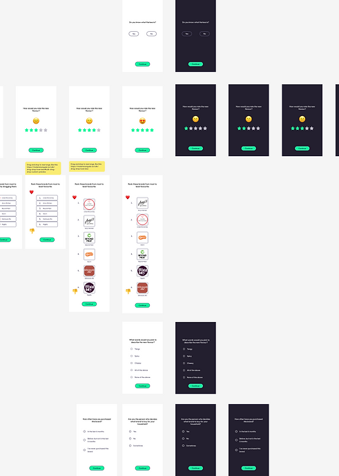
UX improvements to an online survey
The company I worked for as a Product Designer relied on an online survey as part of their data gathering process. They had issues with the dropout rates during the journey and junk responses.
Improvements to the survey experience lead to an almost 10% decrease in dropouts and a significant improvement on data quality.
Data Science Team: 👏
Survey takers: 😍
Business: 🫰
From A to Z
Closed Ended Questions
The platform I was working on allowed users to view responses to survey questions in a word cloud that used NPL technology... but this was only good for open ended questions. For responses to questions that had multiple choice, yes/no and single choice answers there needed to be data visualization that showed a breakdown of the responses by topic, demographic and timeframe.
Just for Fun!
Alkemio Kitchen app
During the pandemic working as a freelancer I'd often have some downtime between jobs to pursue passion projects. A Notting Hill Chef - and good friend of mine - reached out to me to help him launch his new range of hot sauces. He needed someone to take on the brand design work and create a mobile app for orders.
Audience
Data Viz
The platform's users required the ability to observe their audience over time and how they split into segments. The latter also had to be defined via profiling points, plus the ability to compare data and download CSV files.
The result highlights were overall positive:
-
Visits per session from Brand Managers: up by 20% within 5 weeks.
-
Visits per session from Insights Managers: up by 70% within 5 weeks.
-
User satisfaction: from interviews we and surveys we had an average of 3.9/5 in reported satisfaction. It was mostly insights managers who were the happiest, although they would have preferred more abilities.
-
Number of Dowloads: The downloads of CSVs were observed from the launch to 5 weeks after launch and revealed that they downloaded an average of 1.2 times a month, so they were not necessarily looking to report on a weekly or daily cycle.
_edited.jpg)


